
Digihua is composed of three companies and is a leading digitalization solutions provider for smart factories in the Asia-Pacific region, serving over 1,500 benchmark customers globally. Born in Taiwan, developed in China, and expanded across Asia-Pacific, it focuses on smart manufacturing and industrial internet applications.
Currently, Digihua's product portfolio includes MES, APS, QMS, IIoT, and more, all under the blueprint of Manufacturing Operations Management (MOM). However, the lack of a unified brand style and user experience across products has led to a situation where customers need to relearn each product's interface and operation, significantly affecting the system’s efficiency and user experience in the factory.
From the NPS survey, we found that users on both sides of the Taiwan Strait have vastly different interface and operational experience needs, which negatively impacts customers. Therefore, while actively expanding the manufacturing market, the group wants to unify the user experience across devices for all its products.
However, different devices, roles, and countries come with varying operational habits. In this project, we aimed to align the broader brand strategy with product design as the starting point. Despite this, launching across 10 products is a large undertaking, and without in-depth research, rash changes to product interfaces could hinder market expansion with new customers and generate negative reactions from existing ones.
Duration
Nov 2020 - Mar 2023
My Role
UX Mentorship
Design Leadership
Strategic Delivery
Responsibility
Brand Strategy
Product Blueprint
Delivery and Coaching
Objective
Integrate the corporate brand identity system while retaining the original group identity, establishing standards for Digihua's manufacturing market and products to enhance product development efficiency and scalability.
Role & Deliverables
Served as Design PM, working closely with presales, consultants, and PM. Led market and user research across Greater China's manufacturing sector, defined brand value propositions, and developed UI/UX design solutions. Ultimately applying the results across all company products.
Challenges
With diverse national cultures, the brand must align with the company's vision while ensuring memorability. Additionally, as the company's system operates within a multi-device ecosystem, design must account for technical constraints and time limitations.
Outcome & Impact
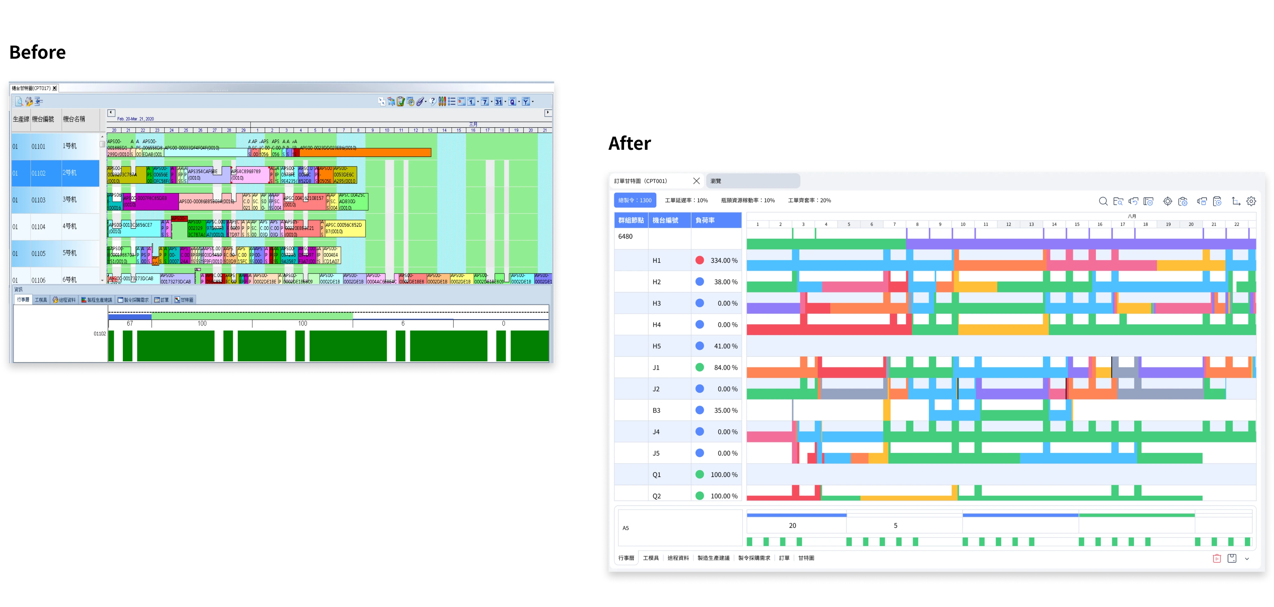
Two years of in-depth research and testing elevated the brand to a new level. Unified the style of 10 products with a 90% completion rate. The design system reduced communication costs by 75% and cut customization time by 43%.
01
Preliminary work
Existing Issues

Our Goal
Brand Core Values, Standardized Design, Driving the Factory Ecosystem
Top-down implementation builds brand capability as a service, aligning with the company's vision to ensure collective consensus. The 'Design System' is a core component of the 'Brand Identity System,' ensuring that all development members (PMs, designers, PR, QA, etc.) contribute to enhancing brand value. Unifies and elevates experiences across different systems, devices, and scenarios.

Hypothesis
Appointed by the chairman, to address internal challenges and support future company strategy. Over a year of research and design iterations, we engaged in multiple discussions with executives to align on project goals and impact. This ensured every team member understood the problems we solve and how our work supported the company's strategic.
Hypothesis 1
A brand system helps establish stability, consistency, and trust in the customer's mind, effectively boosts revenue.
Hypothesis 2
Building design system by devices aligns with user scenarios, enhancing the operational experience.
Challenges
01
Brand Positioning
Before construction, it's essential to ensure the 'brand' positioning is supported across five dimensions: culture, design, society, industry, and technology, aligning with the company's strategy.
02
Convergent Design
In scenarios where multiple devices and users are involved, we need to ensure that the ecosystem we build not only enhances efficiency but also aligns with users' operating habits.
03
Time Constraint
Collaborating with 10 product departments, if we followed the Waterfall Model, the overall timeline would be insufficient. We need to prioritize and implement the most important and widely applicable designs iteratively.
What We Did

Project process
In this project, our primary challenge was overcoming cultural differences. From multiple project experiences, we found clear applied to specific industries and scenarios, Taiwan and China have different in user experiences and visual preferences.
We had to quickly formulate and validate the feasibility of design strategies in this diverse scenarios, while ensuring that the brand value could be effectively communicated across different markets. This was key to the success of the project.

02
Interviews and research
Research
Most products are developed in Taiwan, and the company expanded into the China and Southeast Asian markets in 2019. To reflect localized design, we needed to prioritize cultural differences in our research and fully understand the local markets. As we delve deeper into the manufacturing industry, it's essential to tailor services and features to diverse backgrounds, enhancing the core competitiveness of our products.

From globalization and localization to industry-specific analysis.
Observations
Decompositon
Based on industry application scenarios, we use the 'design system' as the entry point, breaking down elements such as 'color', 'devices', 'operation', and 'environment'. Missing parts include industry scale and user behavior.
Comparison
We compared priority and localized, evaluating the impact of operational behaviors and devices, which is particularly important in the B2B industry, directly affecting efficiency and results. Additionally, to accelerate the market push, color and proportion principles will directly influence the high PDI demand in the China market.
Integration
To meet the needs of both frontline staff and workshop users, the application of color, proportions, and the environment are crucial. They unify the brand, complement the devices, and enhance the overall workshop interaction experience, forming a cohesive ecosystem.
Omission
Due to limited resources, the Dark mode project has been delayed. Although Dark mode could serve as an attractive feature, the risks outweigh the benefits in actual workshop use.

03
Strategy
Our goals and strategy for Design System:
01
Rapid response and decision
Emergency response speed
Customers buy system software is for reduce costs and improve efficiency. We ensure that the user's response time is fast and accurate. The Miller's Law and Maslow's Hierarchy of Needs theory help us achieve this goal.
02
Intuitive and clear
Support goal 1, improve accuracy.
The factory's personas exceed 12 types, with clearly defined tasks. They tend to prefer quick, efficient, and decisive solutions to work needs. Hick's Law helps reduce the number of choices, while Gestalt Principles ensure that information is quickly understood and acted upon.
03
Progressive information presentation to avoid overload,
Prevent information overload,
To further reduce user cognitive load, Progressive Disclosure minimizes unnecessary information, while Fitts' Law ensures improved operational efficiency across different devices.
04
Multi-device integration
Establish industry ecosystem
Customers prefer consistent visuals and experiences across company products. We integrated styles and interactions across platforms using a Clone Family approach, delving into different equipment, roles, and scenarios. This helps them focus on the 20% core functions that matter to the individual, enhancing the device experience."
Deliverables
Converging the Design system into four platforms
Focusing our top strategic goals, we built a unified brand based on the Clone Family design system, integrating products across departments into four major platforms: Mobile, Pad, Web, and Winform. This ensures both consistency and adaptability in style. Ultimately, we enhance the application across devices with intuitive interfaces and clear structures, connecting different scenarios to create a industry ecosystem, improving overall workflow efficiency and consistency."

Select products, experiment, gather feedback, and adjust
Before applying design system to all products, we need to validate its feasibility and risks across the four platforms. We selected different products and their corresponding devices for testing.

Optimization
A streamlined Mobile and Pad experience
B2B business, customer scale and product users have a critical impact on our design. For small and medium-sized enterprises, the requirements are relatively simple, and users are mostly senior executives who primarily use it to gain an overview and make quick decisions. Therefore, in terms of IA, we have standardized mobile devices to ensure that every abnormal situation can be resolved in the shortest possible process.

01
The new information architecture reduces the overall breadth and depth of the site map, making complex functions as simple to use as tools on mobile devices.
02
Factory User have well-defined works, allowing them to customize frequently used modules as their homepage, ensuring a streamlined and task-specific workflow in the factory.
03
We designed a step-by-step guided approach for the function where users spend the most time, ensuring a focused and seamless experience.
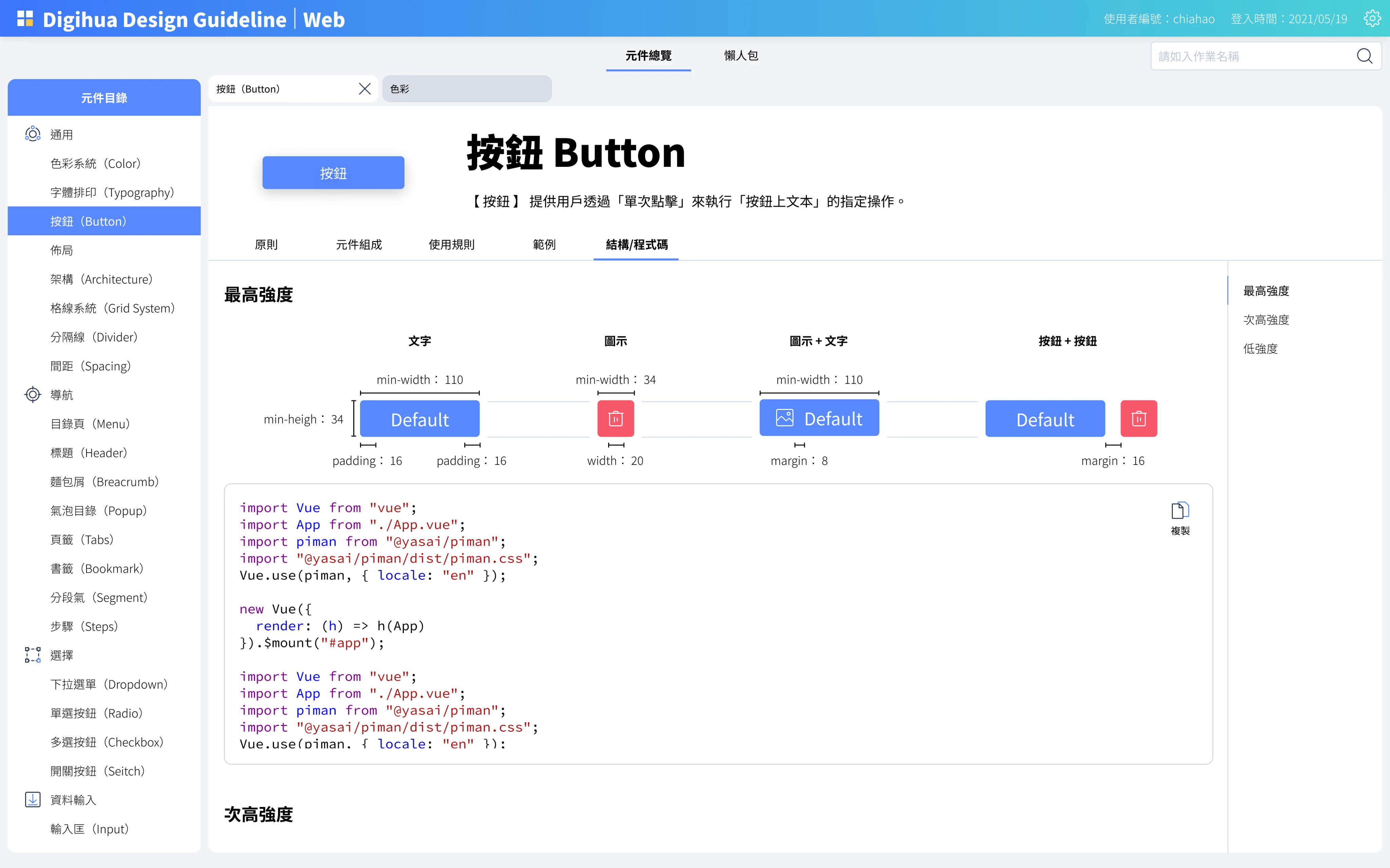
Convenient UI
How to reduce consultant delivery costs and make user interaction as simple as using a calculator for accountants? We need to focus more on click accuracy and visual clarity than general design guidelines, minimizing errors during usage. The goal is to ensure that users of various age groups, nationalities, and 3C usage frequencies in the factory can easily learn the system and effectively address their needs.


01
Shorten the text to 4 ± 2, making it even more concise than Miller's Law suggests, making the overall logical structure more challenging.
02
Larger the click area to accommodate users with low 3C product usage rates, those using gloves, and those interacting with touch pens.
03
Placing buttons vertically is easily lead to accidental taps. Therefore, in the new layout, we reduced the design of vertically placed buttons.
PC devices can display richer content
In the research process, that due to the high PDI and MAS cultural characteristics in the China market, PC users tend to browse more overall information at once. This helps break down feasible solutions and set directions. Therefore, for the fixed-position Web and Winform interfaces, we maintain basic readability while displaying as much content as possible to meet this demand.


01
Customers purchasing the system is to solve high-complexity problems, and PC users roles of front-end planning and back-end analysis in the factory ecosystem.
02
Users process large amounts of information through PC, and we need to ensure that while providing abundant content, information density, visual clarity, and ease of control are all met.
03
To meet Goal 1, we achieve information hierarchy through typography, spacing, and size, using color to highlight key information and the exceptions."
Visualized large-screen dashboard
Real-time information feedback is crucial for the factory production process. Factories typically organize by work zones and use large dashboards to display the status of each area. Additionally, larger screens are used for strategic analysis in meetings. These types of dashboards are referred to as 'War rooms.'
For these products, customers connect via computers and project the display in a 1:1 ratio. To enable real-time monitoring and response, visualized statistical charts are used to help customers quickly understand the situation, and key data is highlighted with larger fonts to improve production efficiency."


01
System needs to be real-time, reflecting the current factory conditions. It should present key metrics through charts, text, and color, enhancing visibility and readability.
02
Customers who use the system for analysis typically do so in the work area and meeting rooms. We design appropriate statistical charts to help users perform deeper data analysis.
03
In the China market, display-oriented needs are more prevalent. We use Dark Mode to enhance the visual experience while also addressing visual fatigue caused by low-light environments.
Color Proportion Rules
82% of B2B decision-makers prefer vendors with a clear brand identity, and color is one of the key factors influencing brand recall. Therefore, in system products that solve high-complexity issues, we apply the 60-30-10 color proportion rule. The 60% white space simplifies the visual hierarchy, allowing users to focus on the 10% status color, while the 30% brand color highlights the brand's proposition, strengthening brand recall and differentiation. This ultimately enables quick responses to the status of people, machines, materials, and components, while also addressing market coverage and brand promotion needs.

01
Based on Digihua's strategic market and user environment, we have defined Digihua's brand color—Coral Blue.
02
The status and emphasis colors in the system have a direct impact on the efficiency of workshop personnel. At the same time, to rapidly cover the market and become a leader, we use 30% of the brand color and 10% of the accent color to enhance brand recognition, while also improving user efficiency, achieving a win-win for both market promotion and process effectiveness.
Rich color palette
The system tools are designed to solve high-complexity problems, and within this, there are complex color-related issues that need to be addressed. For example, the sAPS system needs to handle multiple orders, a challenge that many single-purpose, tool-based products cannot address. Therefore, we tested various scenarios on color issues to validate how the system presents complex colors and how environment, device, and user factors impact them. Our goal is to minimize the associated risks as much as possible.
The complexity of the UI is directly related to the dimensions through which users view it. In Digihua's products, colors related to 'orders,' 'processes,' and 'machine status' have high complexity. When testing these system screens in different usage scenarios, we found that some default colors caused misjudgments in extreme environments. As a result, we adjusted the colors that were prone to misinterpretation."

01
The hues of light green (133), blue-green (168), and light blue (198) were difficult for testers to distinguish. To improve recognition, we increased the contrast between green and blue.
02
The hues of purple (258), pink-purple (288), and pink (318) were found to be difficult for users to distinguish in qualitative testing. To reduce cognitive load, we decided to retain only two of them."
03
The hues of pink (318) and orange (18) share similar warmth, saturation, and brightness, making them difficult for users to distinguish. We using Delta E analysis, confirmed their low contrast. We increased the saturation of both colors and adjusted the pink hue down to 300, creating a clearer distinction between warm and cool tones.
04
The low-saturation yellow (48) has an earthy tone, often mistaken for orange by test participants. To improve clarity, we increased its saturation for better distinction. Additionally, we enhanced the saturation of purple to create a more balanced overall visual experience.
04
Development and Ecpansion
In the past development experience, we have learned that no matter how meticulous the research and design are, many factors can still impact the final implementation. To ensure the success of this design, we established a design system and optimized existing products. By refining the rollout process, we can integrate products more quickly, validate user experience and market fit efficiently, and ultimately enhance the overall efficiency of the factory ecosystem.
System Development
In Digihua's development process, the design system will serve as the foundation for collaboration among four key roles: SA, SD, PR, and designers. As designers, we analyzed past development workflows, formulated hypotheses, and continuously engaged with relevant team members to clarify mutual interests. Our goal is to simplify processes, reduce rework, and minimize communication and maintenance costs through the design system. By implementing this comprehensive design system, we ensure that our products align with market demands and user experience while fostering consensus within the development team.

01
UI component usage
Which UI components will be used based on functionality and workflow?
How are UI components applied in different scenarios?
SA
SD
02
UI component variations
What are the states and interactions of UI components?
How do components assist users in achieving their goals in different scenarios?
What are the behaviors of components, and how can guidelines help prevent PR development errors?
SD
PR
03
Inconsistent details
How to avoid defining the same UI components with different code in PRs.
How should the interaction of UI components be presented?
How to avoid inconsistencies in naming and logic coding?
PR
Designer
04
Scenario and framework
How should UI components be paired in different scenario.
How should UI components be configured and layout on screens of different sizes?
How should UI components be configured and layout of different frameworks?
Designer
SA
05
Scenario confirmation
The process of understanding the scenarios is time-consuming.
PR spends more time communicating and discussing implementation feasibility with SA/SD.
SA
PR
06
Usage confirmation
What research results are the application and layout of UI components based on?
SD
Designer
Through research, we identified the pain points and needs of the four roles (users) in the development process. From previous user interviews, we also learned that users from different departments have different development processes and habits, and that the products they are responsible for face various industries, scales, regions, and business scenarios, leading to different user needs. This is why we spent more time organizing the dependencies between these needs, and solved them with modular solutions to cater to diverse requirements.
We support the design system with principles, components, rules, examples, and code, to understand the pain points and needs of the four roles. We continue to prioritize brand consistency and commercial value while ensuring 'technical consistency' and 'cross-department consensus,' so that the design system effectively supports the company's strategy and reduces costs."

Scenario-based for dummies
Digihua's market is in the manufacturing industry, and by further segmenting the manufacturing industry, we can observe differences in production processes and core needs. Through the design system, we can ensure consistency across different projects, styles, components, and interaction patterns. However, this only meets basic operations and industry-wide functions. For the differentiation and core values within the manufacturing industry, we still need to continue research to foresee unknown needs and control risks.
To deepen our response to the rapid changes in the manufacturing market and business, we use a 'quick guide' approach. Based on new research and changes in company strategy, we continuously update and educate. With this design thinking, even when encountering new industries or scenarios, we can quickly adjust and expand, maintaining the product's competitiveness.

We have summarized a part called the 'quick guide,' distinguishing it from the design system. The goal is to quickly help users grasp the scenarios of events in a short time, segmenting exclusive scenarios or allowing for the independent adjustment of items at once.
Implementation Order
Our goal is to unify 10 major products within 6 months. We know that with a product, there are mobile, PC, and other device versions, and for the team, products that are not unified incur high maintenance and delivery costs. For future business strategies, we want to reduce customers' distrust and learning costs. Therefore, our goal is to achieve the best results with the least cost in a short time, while minimizing technical limitations.
If we follow waterfall development for a single module or product, we would encounter the following issues:
01
Market is changing rapidly, and if we complete each task one by one, it will inevitably increase waiting times and lead to the design system becoming a 'rigid framework.
02
The different technologies and interaction logics of the products are inconsistent, which can lead to technical bottlenecks or resource shortages.
03
Each product department has different KPIs, processes, and resource allocation issues. If communication is not consistent, the design cannot be implemented effectively.

Establishing a unified brand language is not an overnight task. Therefore, our team uses the Impact Effort Matrix as an internal discussion tool to ensure we achieve the most ideal results within the given timeframe. Since the short-term effects are limited, we have divided the overall design rollout into two phases: the first phase focuses on low investment with high impact, and the second phase focuses on high investment with high impact. The goals for each phase are as follows:
•「Low investment with high impact」:
In the short term, we aim to enhance brand recognition by focusing on the visual aspect. This approach minimizes the risk of large-scale changes and reduces cross-department collaboration costs, ensuring high user acceptance.
•「High investment with high impact」:
In the long term, we aim to enhance product competitiveness by focusing on the experience layer, prioritizing adjustments to core features that are used frequently. This will ensure improved integration and usability.

For a new design system, the 'introduction' is a crucial process that impacts the degree of implementation, long-term collaboration, and opportunities for securing resources. This time, we adopted a phased approach to introduce, iterate, and strengthen internal consensus. The overall outcome turned out to be more comprehensive than expected. Although initially, most people's understanding of the complete definition centered around 'opinions,' the design team was able to build cross-department trust over the six months and secured more resources for more complex experience design in the future.
05
Project Achievements
A Cost-Effective and Efficient Design System
In 2024, we successfully reduced costs by over 50%. After implementing the new design, the Net Promoter Score (NPS) for both updated and new customers reached 71. Additionally, we conducted an internal survey, revealing an internal NPS of 74. This indicates a strong consensus on the new design and design system. For a B2B business model, beyond enhancing product consistency and flexibility, this also helps frontline teams improve sales and service efficiency.

Internal Success
Overall, the design team's UI workload has significantly decreased, allowing us more opportunities to delve into industry and user experience issues. In terms of communication, we were able to finalize the interface in one go and focus on business strategy. Regarding customization requests, we have also reduced labor and time costs.
External Success
From 2023 to 2024, despite the economic downturn in China, our sales performance and market coverage continued to grow. Customer feedback, reflected in the NPS score approaching 60, indicates that the introduction of the design system has empowered frontline sales, enhancing market flexibility and conversion rates.

Continues to be optimized design system based on business strategy.
We believe that long-term focus will drive compound growth for the company.
After completing the first version of our branded design system, we quickly update 10 products, ensuring greater consistency across mobile, PC, and industrial computer devices. During the development of the design system, that customization challenges remained high. Although our company’s strategic market had been segmented, the manufacturing industry still contained many specialized know-how areas.
To reduce development costs, we launched a highly configurable platform in 2024, integrating the existing design system and icon system. This significantly reduced development and refactoring expenses.
The following screens showcase our developed and currently tested high-configuration platform. We aim to help customers accelerate development and seize more business opportunities through this platform."


01
Categorizing data, processes, and pages, users can build functions within different modules quickly to meet their specific scenarios.
02
Minimized the use of code, enabling both developers and non-technical personnel to quickly understand requirements, set directions, and reduce hidden communication costs.
03
High-configurable platform connected with design system allows users to assemble and configure applications using visual modules through a graphical interface.
Reflection & Learning
In this project, we executed brand design for a group formed by the merger of multiple companies, a process that was complex and required careful consideration from various angles. The team chose the design system as the entry point, not just listing UI components, but analyzing the market, products, and users from three perspectives, considering both internal and external influences. The goal was to 'align with user scenarios and achieve cost reduction and efficiency improvement.'
As a designer in this project, the challenge was not only design and user research but also resolving conflicts among stakeholders. The system would affect 10 products, over 300 users, 5 types of devices, and 7 manufacturing industry scenarios. During cross-department collaboration, many people focused on their interests and perspectives.
We used the OGSM model to break down personnel, objectives, technology, resources, and priorities, integrating user experience and product strategy into daily discussions to continuously optimize the design system. This was not only a task but also a belief — to create the company' s first design brand.
Ultimately, this project deeply taught me that design to balancing business strategy with user experience is crucial. Strategic thinking became the key to solving problems efficiently within limited time. In the end, we learned how to make design implementation align with business objectives, while identifying both differences and commonalities in cross-cultural design, solving user pain points while addressing business challenges."


